Plotting
ROTIR provides several visualization functions for temperature maps and stellar geometry. All plotting uses PyPlot (Matplotlib).
2D projection
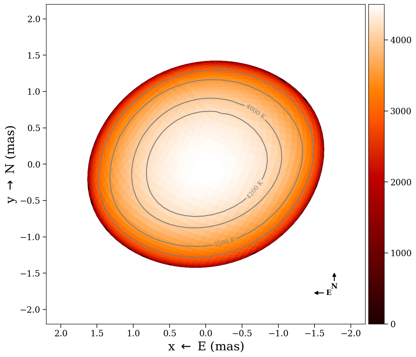
Plot the temperature map as seen by the observer at a single epoch:
plot2d(tmap, stars[1])Options:
plot2d(tmap, stars[1];
    intensity      = false,       # multiply by limb-darkening map
    plotmesh       = false,       # show pixel edges
    colormap       = "gist_heat", # matplotlib colormap
    figtitle       = "Epoch 1",
    flipx          = false,       # flip East-West
    background     = "black",
    compass        = false,       # draw N/E compass arrows
    graticules     = false,       # draw lat/lon grid lines on the surface
    rotation_axis  = false,       # draw dashed line through poles
    rotation_arrow = false,       # draw spin direction arrow at north pole
    star_params    = nothing,     # pass star_params for exact graticules
    graticule_kwargs = (;),       # graticule style overrides (see below)
)
The projection shows the sky plane in milliarcseconds (East left, North up). Only pixels with positive soft visibility weight are rendered.
Temperature contours
Draw temperature contour lines on the projected surface by passing an array of temperature values:
plot2d(tmap, stars[1];
    contours       = [3000, 3500, 4000, 4200],       # temperature levels (K)
    contour_color  = "gray",     # line and label color (default "gray")
    contour_labels = true,       # label each contour with "XXXX K" (default true)
    contour_fontsize = 10,       # label font size (default 10)
)
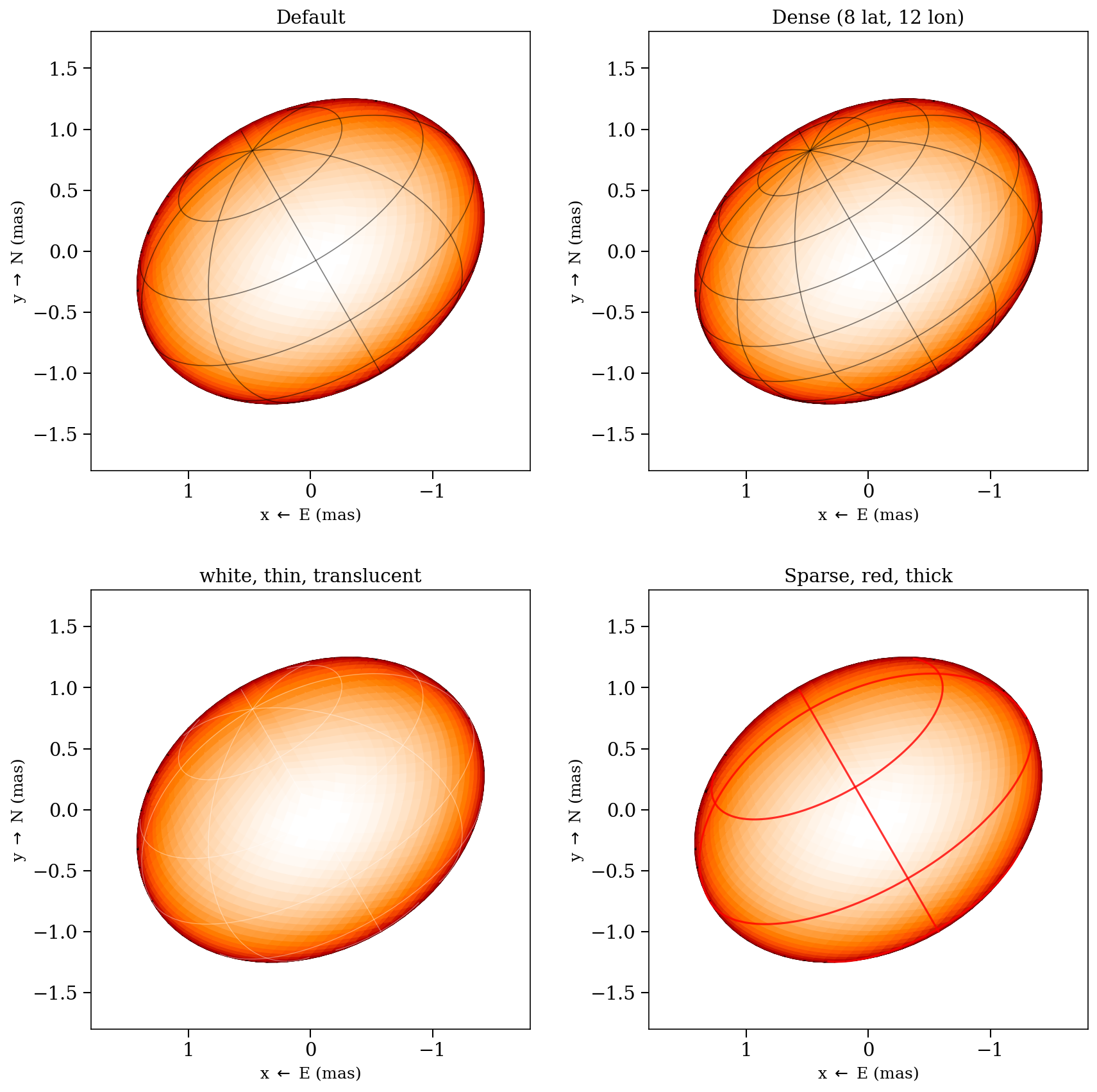
Graticules
When graticules = true, latitude/longitude grid lines are drawn on the stellar surface. Pass star_params to use the exact surface geometry:
- Sphere (type 0): uses
radiusdirectly - Triaxial ellipsoid (type 1): uses
radius_x,radius_y,radius_z— latitude circles are ellipses when the equatorial radii differ - Rapid rotator (type 2): uses
rpoleandfrac_escapevel— longitude lines follow the exact Roche meridional profile viaf_rapid_rot
Without star_params, graticules fall back to an oblate spheroid approximation estimated from the tessellation vertices.
Customize the graticule appearance via graticule_kwargs:
plot2d(tmap, star;
    graticules = true,
    star_params = star_params,
    graticule_kwargs = (
        nlat      = 8,        # number of latitude circles (default 5)
        nlon      = 12,       # number of longitude lines (default 8)
        color     = "white",  # line color (default "black")
        linewidth = 0.6,      # line width (default 0.8)
        alpha     = 0.4,      # opacity (default 0.5)
    ),
)
The rotation angle is computed automatically from star.t and star_params.rotation_period, so graticules stay aligned with the surface at any rotational phase.
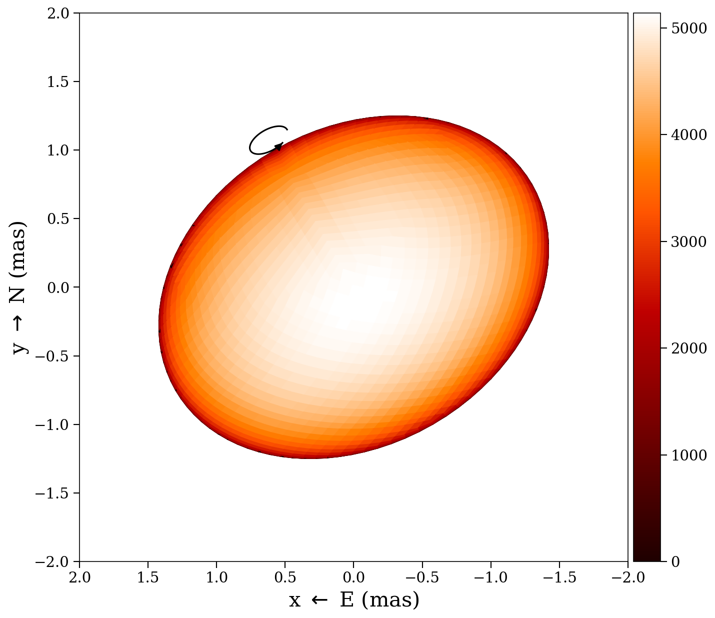
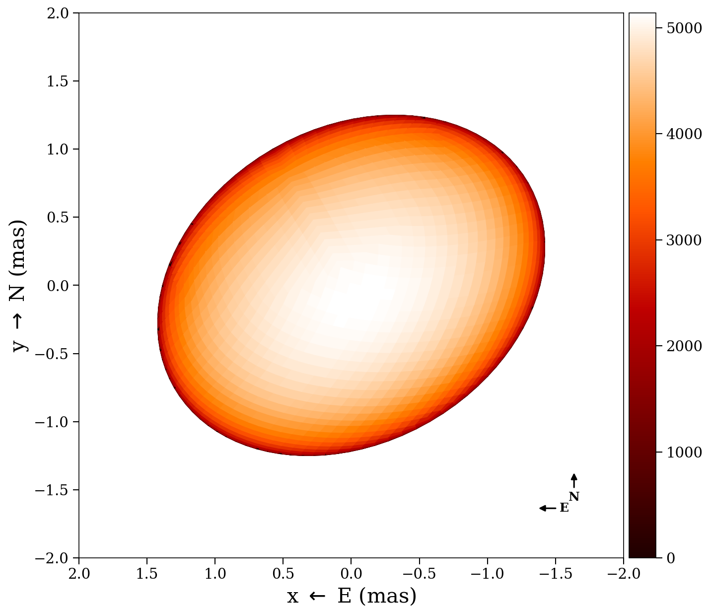
Decorations
Three annotation overlays are available on top of the surface plot:
- Pole line (
rotation_axis = true) — dashed line through the projected rotation axis (north to south pole), with an arrow at the north pole - Spin arrow (
rotation_arrow = true) — curved arrow at the north pole showing the sense of prograde rotation (solid in front, dashed behind the limb) - Compass (
compass = true) — E/N compass arrows in the lower-right corner (East points left, following astronomical convention)
plot2d(tmap, star;
    rotation_axis  = true,
    rotation_arrow = true,
    compass        = true,
    inclination    = 60.0,   # degrees from LOS (for exact axis placement)
    position_angle = 30.0,   # degrees, N through E
)| Pole line | Spin arrow | Compass | All three |
|---|---|---|---|
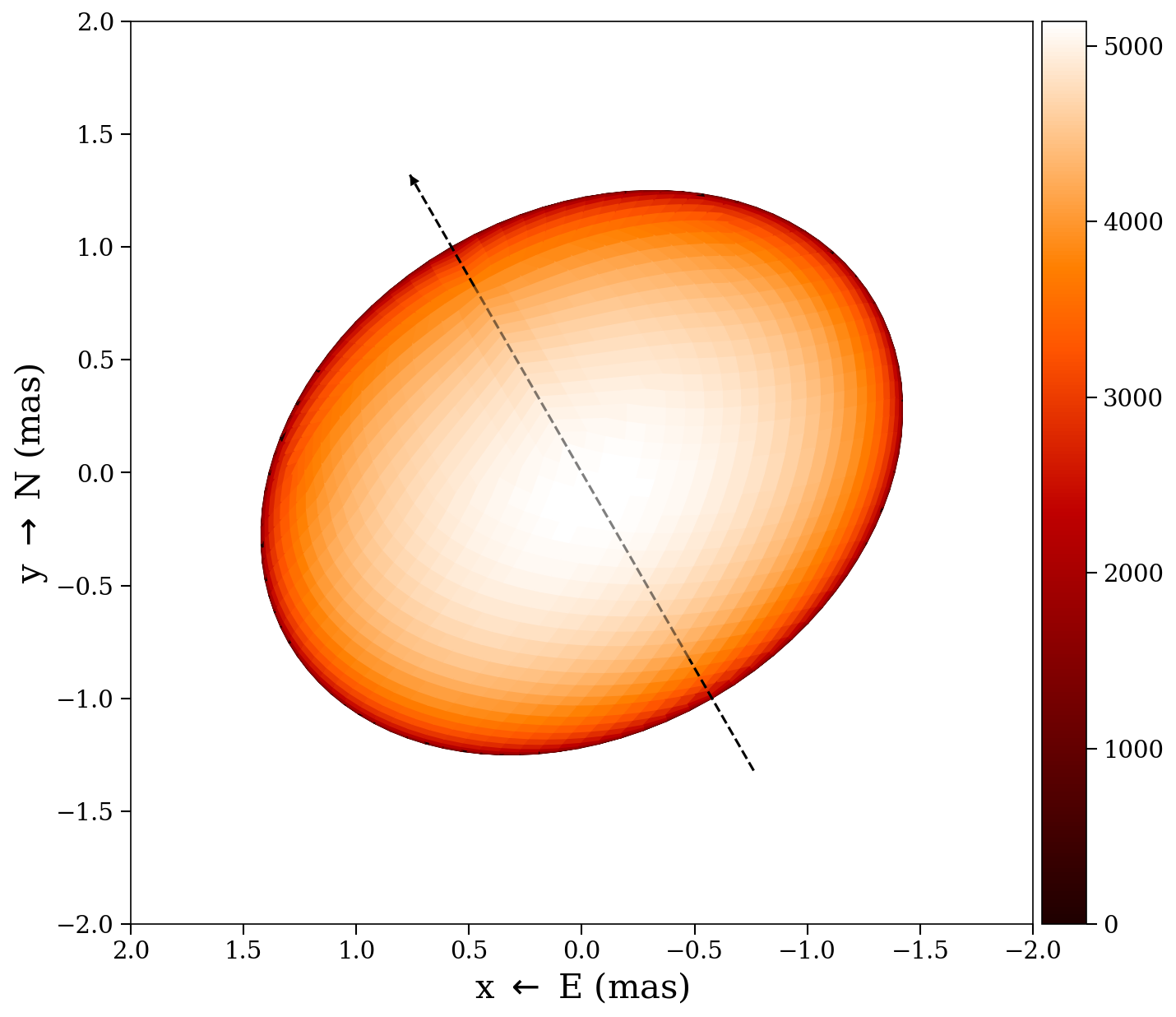 |  |  |  |
Multi-epoch 2D
Plot all epochs side by side with a shared color scale:
plot2d_allepochs(tmap, stars)Options:
plot2d_allepochs(tmap, stars;
    plotmesh = false,
    tepochs  = tepochs,       # epoch labels
    colormap = "gist_heat",
    arr_box  = 23,            # subplot layout: 2 rows, 3 columns
)
Wireframe
Overlay a wireframe of the projected pixel edges:
plot2d_wireframe(stars[1])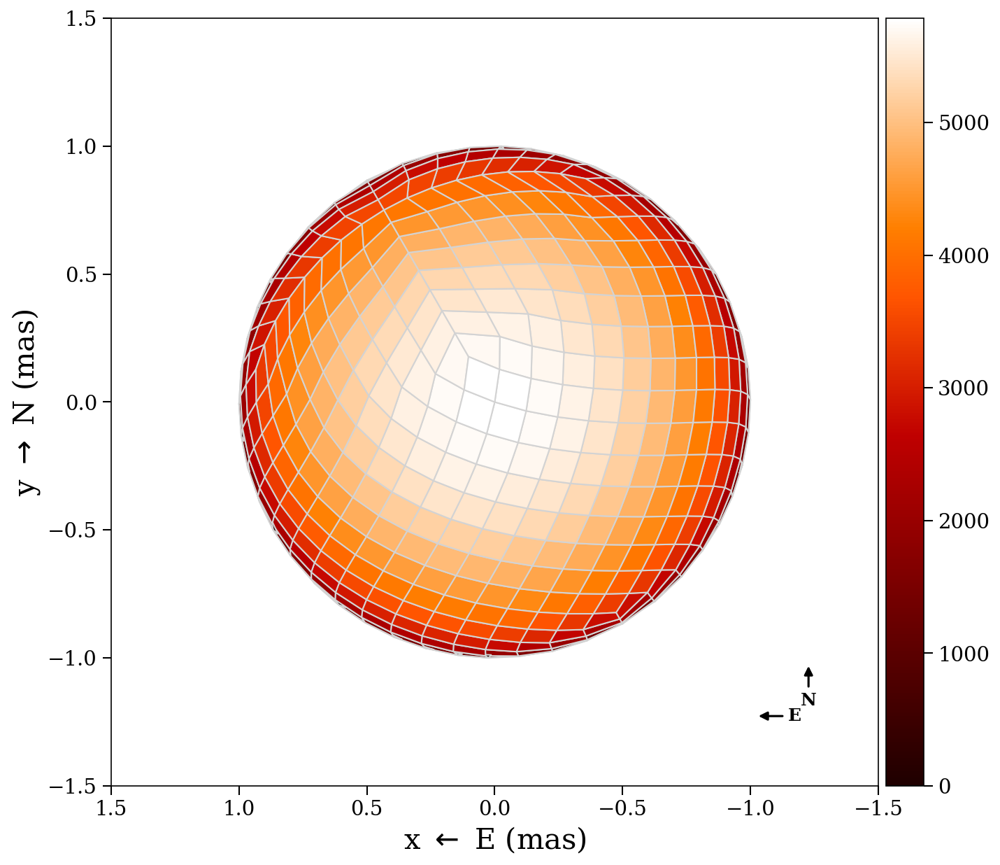
3D surface
Render the star as a 3D surface with colored temperature patches:
plot3d(tmap, stars[1])3D vertices (debug)
Show the quad vertices (blue) and centers (red) in 3D:
plot3d_vertices(stars[1])Mollweide projection
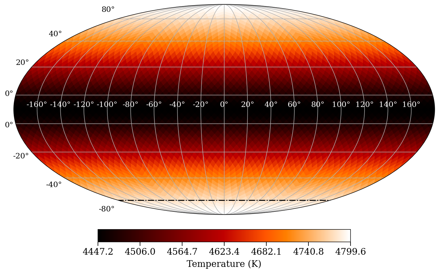
Show the full-surface temperature map in a Mollweide (equal-area) projection:
plot_mollweide(tmap, stars[1])This automatically selects the HEALPix or lon/lat variant based on the tessellation type. Options:
plot_mollweide(tmap, stars[1];
    visible_pixels  = [],            # pixels observed at any epoch
    mask_unobserved = true,          # gray out unobserved pixels (default true)
    bad_color       = "lightgray",   # color for unobserved pixels (default "lightgray")
    vmin            = 4000.0,        # color scale minimum
    vmax            = 5000.0,        # color scale maximum
    colormap        = "gist_heat",
    incl            = 78.0,          # draw inclination line
    figtitle        = "Mollweide",
    lon_color       = "white",       # longitude tick label color (default "white")
    lat_color       = "black",       # latitude tick label color (default "black")
)
When visible_pixels is provided and mask_unobserved = true (the default), pixels that were never observed are rendered in bad_color. Use sometimes_visible(stars) to get the list of pixels visible at any epoch:
vis = sometimes_visible(stars)
plot_mollweide(tmap, stars[1], visible_pixels=vis)
The Mollweide projection shows longitude on the x-axis (-180 to 180 degrees) and latitude on the y-axis (-90 to 90 degrees), with a graticule at 20-degree intervals.